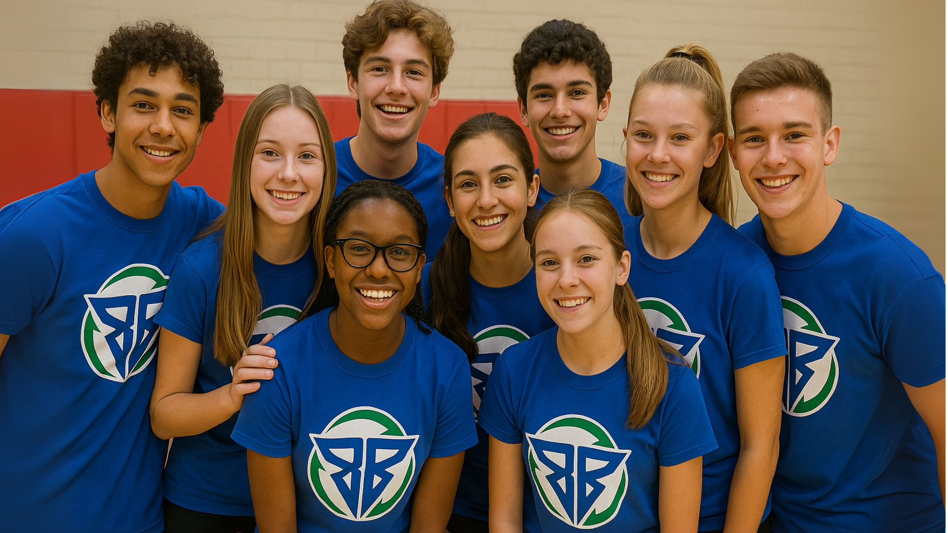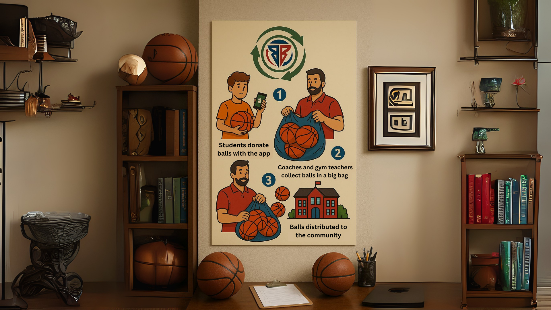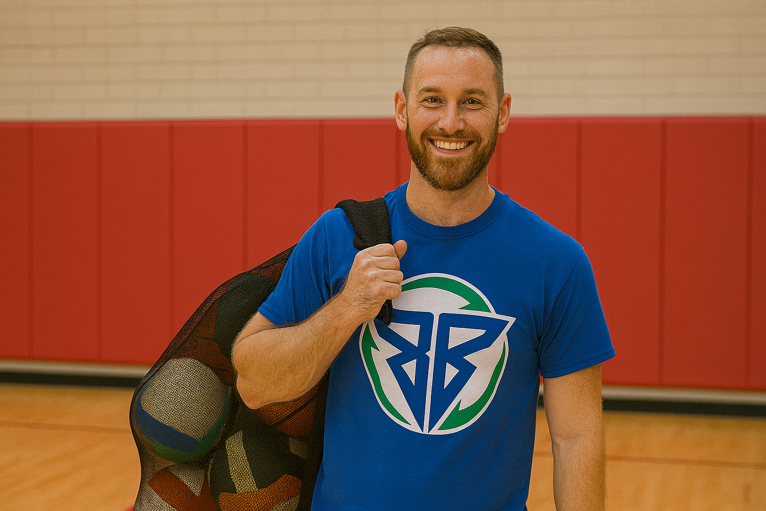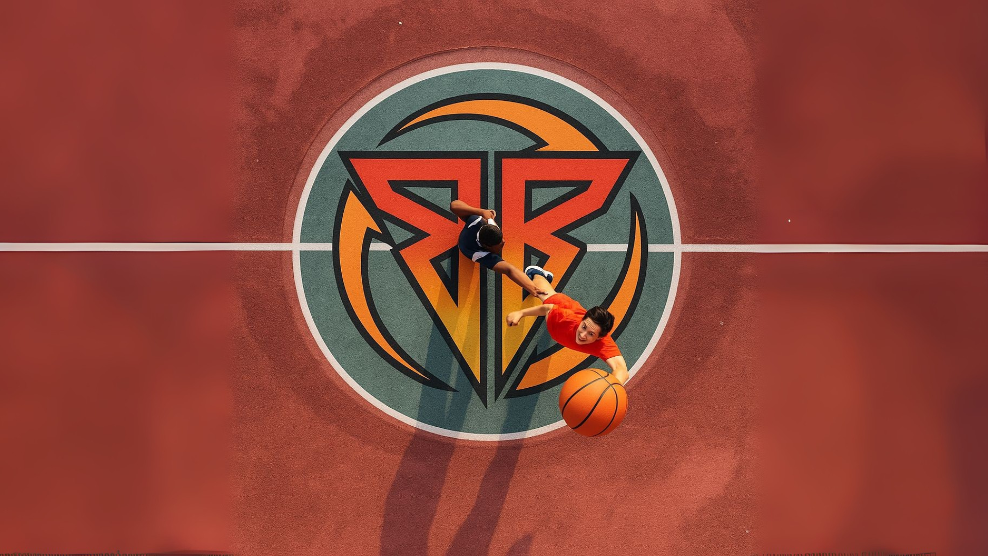

We designed the Bounce Back icon by merging two angular Bs into a bold, symmetrical monogram. Framed by green recycling arrows that subtly form a ball, the mark symbolizes both movement and reuse, capturing the organization’s mission to give gear a second life while energizing the visual language of sport.
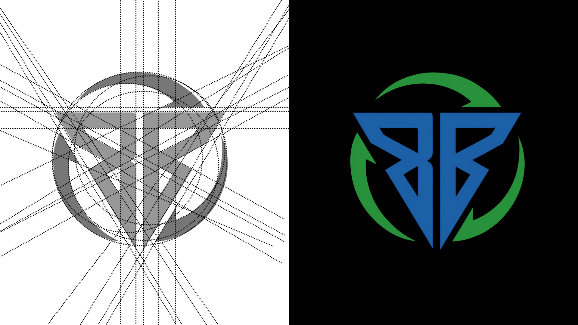
We chose this color palette to reflect motion, renewal, and inclusivity. The vibrant blue conveys energy, trust, and youthfulness, while the rich green symbolizes growth, sustainability, and forward movement. White adds clarity, openness, and balance, creating a brand that feels fresh, optimistic, and purpose-driven.
